Claims Prediction
Part I: Understanding the Data
In Spring of 2024, I joined a workshop organized by AXA Germany at the Maastricht Business Days. The actuaries presented their work in the automotive insurance segment of the business and tasked us with determining the best model specification to most accurately predict insurance claims in the auto insurance sector. The aim of this project to gain a better understanding of logistic regression in R.
Data
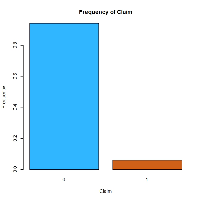
Figure $1$: Frequency of Claims.
The dataset contains $58,592$ observations of $44$ variables. The dependent variable is_claim is binary variable representing whether a given policyholder filed a claim in the following $6$ months. The dataset is larger than what I am used to both in terms of observations and number of variables but I doubt that all the variables are relevant. I made the choice to reduce the size of the sample to $1000$ observations and these observations were randomly selected by a custom-made sample.row() function. Given the small share of people who made a claim in our sample, this segment of the population will referred to as the minority class.
In order to select the relevant variables, I took a look at some online sources. The comparison website Compare the Market provides some indications on the factors that impact car insurance premiums. The article claims that one’s occupation, annual mileage, address, age, and driving history are important variables in determining one’s insurance premium. Other factors include the make and model of your car, the place where the car is parked overnight, and the other drivers name in your insurance policy. Another article by the Insurance Information Institute claims that the main factors that influence insurance rates are one’s driving record, mileage, location, age and car characteristics such as its (repair) cost, likelihood of theft and engine size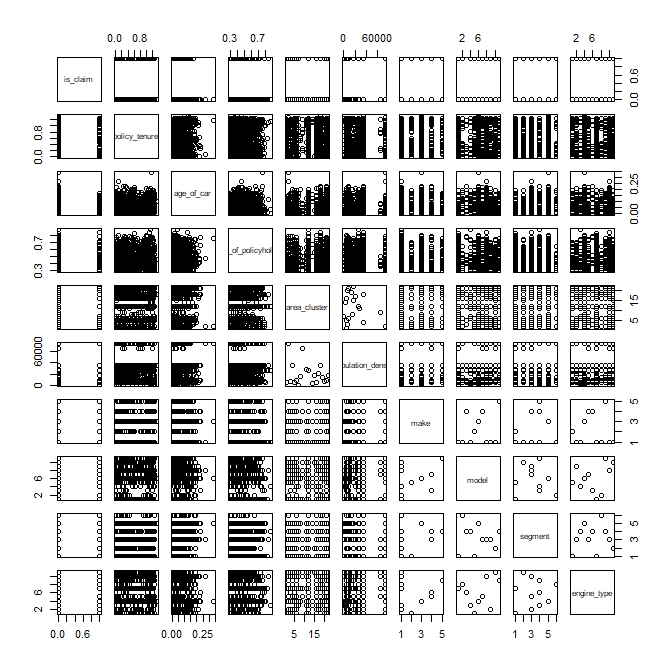
Figure $2$: Pairs plot of chosen variables..
| Variable | Description |
|---|---|
| policy_tenure | Time period of the policy |
| age_of_car | Normalized age of the car in years |
| age_of_policyholder | Normalized age of policyholder in years |
| area_cluster | Area cluster of the policyholder |
| population_density | Population density of the city (Policyholder City) |
| make | Encoded Manufacturer/company of the car |
| segment | Segment of the car (A/ B1/ B2/ C1/ C2) |
| model | Encoded name of the car |
| engine_type | Type of engine used in the car |
The variables that most resembles those mentioned in the articles are in the table above and are plotted against each other in Figure $2$. In order for the plots to remain clear, only a random selction of $1000$ observations of the dataset are plotted. However, it is still very difficult to make sense of the data as the visualization does not make any trend appear at first glance. It may be beneficial to take a look at each independent variable individually.
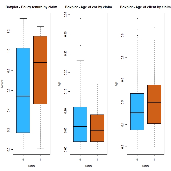
Figure $3$: Boxplots of quantitative variables.
In Figure $3$, those who filed claims appear to have longer tenures than those who don’t. Since driving history is a factor used by insurance companies in the pricing of insurance claims then people with shorter tenures (shorter driving histories with the firm) might be more relunctant to file a claim to avoid negatively impacting their driving record with the firm. I assume that a customer that files a claim in the first year of their policy is a worst customer (and maybe a worst driver, but that is a big assumption) than someone filing a claim in their fifth year. Our sample tends to possess more recent models and those that have filed claim do not appear to own noticeably younger or older models but their cars are slightly more recent. Lastly, the minority class is on average older than the majority class.
Most categorical variables can hardly be displayed in a boxplot and thus require an alternative visualization method. Barplots can be used to show the relative frequency of the two classes for each category.
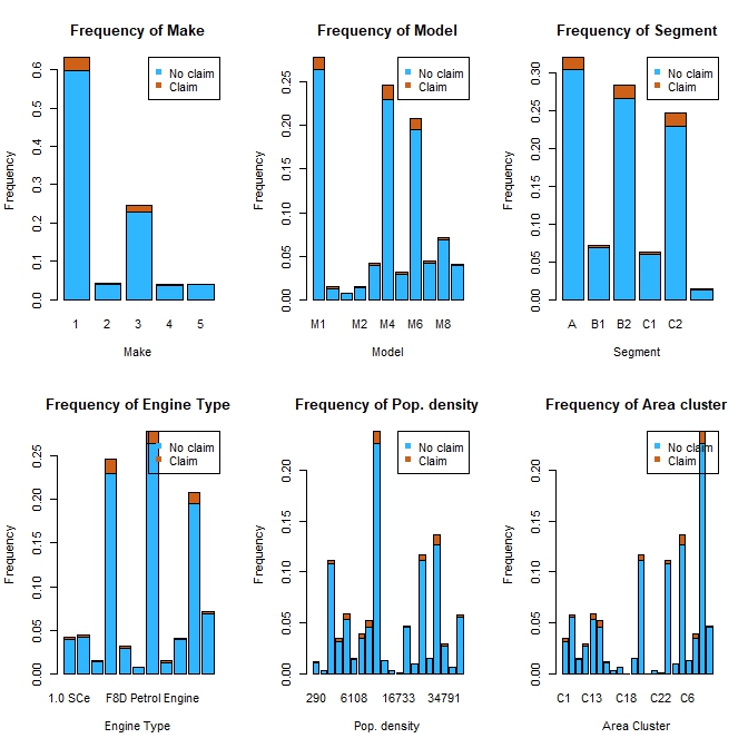
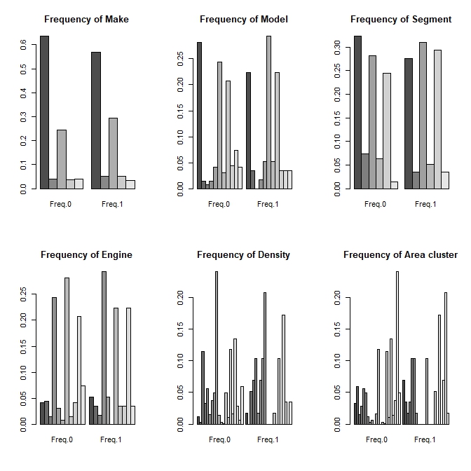
Figure $5$: Uglier Barplots.
Looking at the bar plots in Figure $4$, it appears that categories that are overrepresented in the minority class are also overrepresented in the majority class. It is possible that the use of other types of visualizations could have led to different conclusion however, the chosen categorical variables do not appear to expose anything differences between the two populations. However, Figure $5$ shows, in a slightly better way, the distributional differences between the two classes. It is much easier to see that some categories are overrepresented or underrepresented in the minority class compared to the majority class.
Methodology
The analysis will mostly rely on the binomial logistic regression model as the dependent variable is the dummy variable. The validation metrics considered are the AIC for the evaluation of the model specification and the Area Under the Receiver Operating Characteristic curve (AUC-ROC) to evaluate the classication accuracy.